
2022
Equalia
UI/UX design for a company that oversees sport facilities all around France and Belgium.
Webdesign
Photography
Know More
UI/UX design for a company that oversees sport facilities all around France and Belgium.
Problem
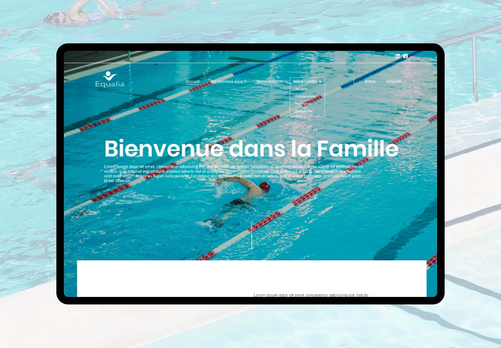
Equalia's website was very outdated, did not work properly and was actively hurting the company. Something had to be done.
Equalia is a company that has to communicate visually, it does that for others but forgot to do it for itself. The branding was obsolete, the site was very buggy and a nightmare to browse. That hurt the image of the company as a whole. Your website is your ID and your proof of concept you can not simply ignore it and hope it goes away.

Solution
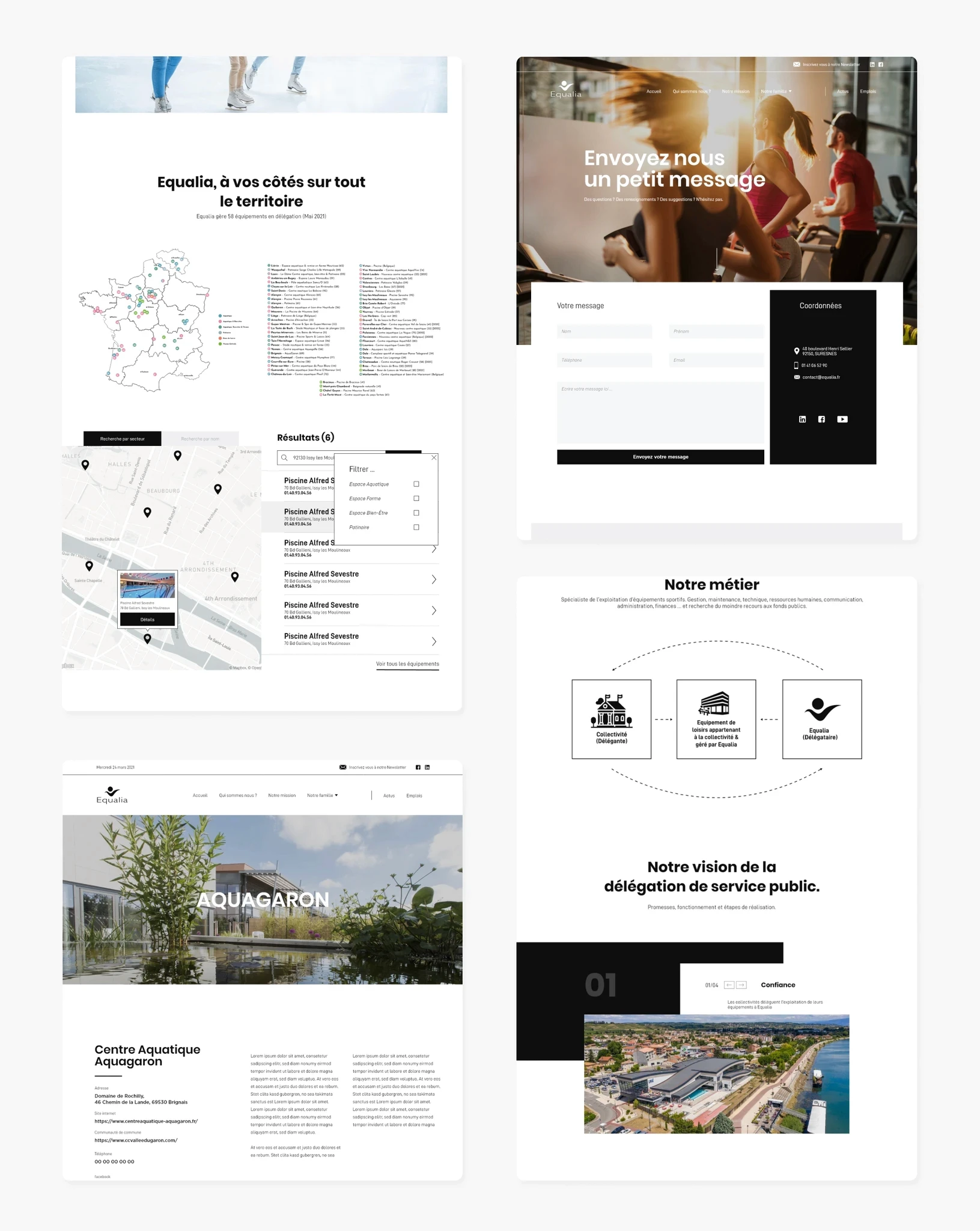
The solution was simple, Equalia's site was so obsolete that I basically had carte blanche to change whatever I wanted as long as I could explain my choices. The goal was to reassure prospects, present a company that values quality, trust and image. After creating an extensive document explaining the issues and the solutions that I came up with and some exchanges with the higher ups it was time for some designing:
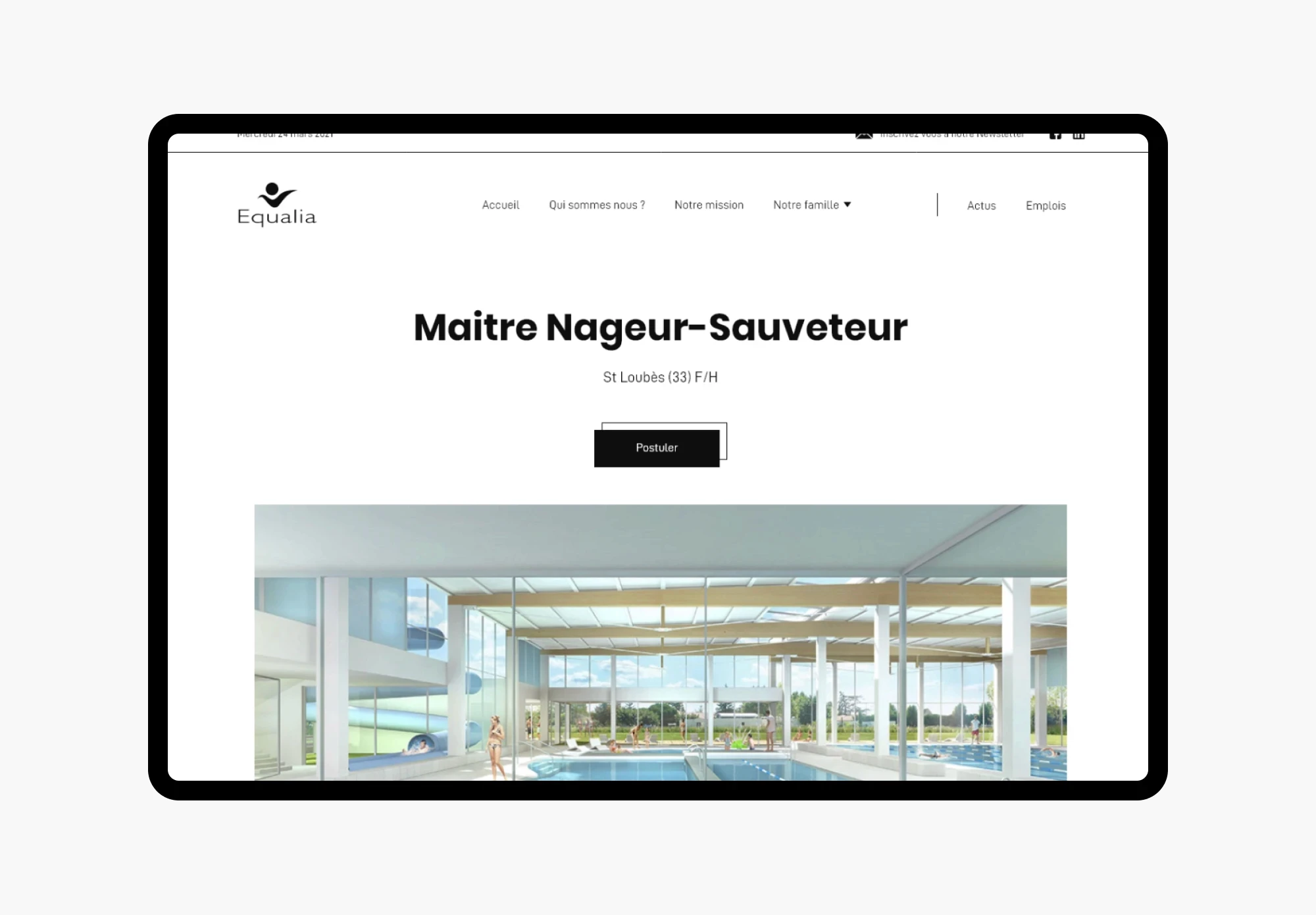
I wanted to break away with the traditional blues and greens used when talking about swimming pools. My aim was to create a sense of luxury, of quality and of modernity that Equalia's competitors did not convey. Hence my choice of black and white, inspired by Nike or Adidas, and the use of quality images (some I took myself) helped to elevate Equalia's identity to that level. I also made sure that design reflected the need for the site to be usable, easy to navigate with a strong visual identity to explain effectively the mission and the values.
More Works
(KC® — 02)
©2024


FAQ
01
What does a project look like?
02
Are all projects fixed scope?
03
What do I need to get started?
04
Are you full remote only?
2022
Equalia
UI/UX design for a company that oversees sport facilities all around France and Belgium.
Webdesign
Photography
Know More
UI/UX design for a company that oversees sport facilities all around France and Belgium.
Problem
Equalia's website was very outdated, did not work properly and was actively hurting the company. Something had to be done.
Equalia is a company that has to communicate visually, it does that for others but forgot to do it for itself. The branding was obsolete, the site was very buggy and a nightmare to browse. That hurt the image of the company as a whole. Your website is your ID and your proof of concept you can not simply ignore it and hope it goes away.
Solution
The solution was simple, Equalia's site was so obsolete that I basically had carte blanche to change whatever I wanted as long as I could explain my choices. The goal was to reassure prospects, present a company that values quality, trust and image. After creating an extensive document explaining the issues and the solutions that I came up with and some exchanges with the higher ups it was time for some designing:
I wanted to break away with the traditional blues and greens used when talking about swimming pools. My aim was to create a sense of luxury, of quality and of modernity that Equalia's competitors did not convey. Hence my choice of black and white, inspired by Nike or Adidas, and the use of quality images (some I took myself) helped to elevate Equalia's identity to that level. I also made sure that design reflected the need for the site to be usable, easy to navigate with a strong visual identity to explain effectively the mission and the values.
More Works
(KC® — 02)
©2024
FAQ
01
What does a project look like?
02
Are all projects fixed scope?
03
What do I need to get started?
04
Are you full remote only?
2022
Equalia
UI/UX design for a company that oversees sport facilities all around France and Belgium.
Webdesign
Photography
Know More
UI/UX design for a company that oversees sport facilities all around France and Belgium.
Problem
Equalia's website was very outdated, did not work properly and was actively hurting the company. Something had to be done.
Equalia is a company that has to communicate visually, it does that for others but forgot to do it for itself. The branding was obsolete, the site was very buggy and a nightmare to browse. That hurt the image of the company as a whole. Your website is your ID and your proof of concept you can not simply ignore it and hope it goes away.
Solution
The solution was simple, Equalia's site was so obsolete that I basically had carte blanche to change whatever I wanted as long as I could explain my choices. The goal was to reassure prospects, present a company that values quality, trust and image. After creating an extensive document explaining the issues and the solutions that I came up with and some exchanges with the higher ups it was time for some designing:
I wanted to break away with the traditional blues and greens used when talking about swimming pools. My aim was to create a sense of luxury, of quality and of modernity that Equalia's competitors did not convey. Hence my choice of black and white, inspired by Nike or Adidas, and the use of quality images (some I took myself) helped to elevate Equalia's identity to that level. I also made sure that design reflected the need for the site to be usable, easy to navigate with a strong visual identity to explain effectively the mission and the values.
More Works
©2024
FAQ
What does a project look like?
Are all projects fixed scope?
What do I need to get started?
Are you full remote only?